Overview
Build applications and interact with Avalanche networks programmatically
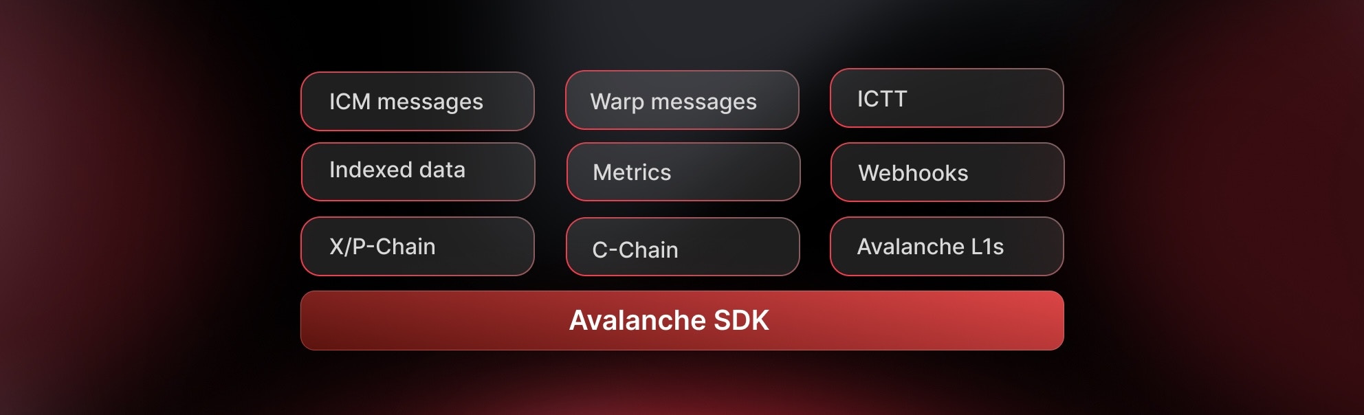
The Avalanche SDK for TypeScript is a modular suite of tools designed for building powerful applications on the Avalanche ecosystem. Whether you're building DeFi applications, NFT platforms, or cross-chain bridges, our SDKs provide everything you need.
Core Capabilities
- Direct Chain Access - RPC calls, wallet integration, and transaction management.
- Indexed Data & Metrics - Access Glacier Data API & Metrics API with type safety.
- Interchain Messaging - Build cross-L1 applications with ICM/Teleporter.
Developer Preview: This suite of SDKs is currently in beta and is subject to change. Use in production at your own risk.
We'd love to hear about your experience! Please share your feedback here.
Which SDK Should I Use?
Choose the right SDK based on your specific needs:
| SDK Package | Description |
|---|---|
@avalanche-sdk/client | Direct blockchain interaction - transactions, wallets, RPC calls |
@avalanche-sdk/chainkit | Complete suite: Data, Metrics and Webhooks API |
@avalanche-sdk/interchain | Send messages between Avalanche L1s using ICM/Teleporter |
Quick Start
npm install @avalanche-sdk/clientyarn add @avalanche-sdk/clientpnpm add @avalanche-sdk/clientBasic Example
import { createClient } from '@avalanche-sdk/client';

// Initialize the client
const client = createClient({
  network: 'mainnet'
});

// Get balance
const balance = await client.getBalance({
  address: '0x...',
  chainId: 43114
});

console.log('Balance:', balance);
Available SDKs
Client SDK
The main Avalanche client SDK for interacting with Avalanche nodes and building blockchain applications.
Key Features:
- Complete API coverage for P-Chain, X-Chain, and C-Chain.
- Full viem compatibility - anything you can do with viem works here.
- TypeScript-first design with full type safety.
- Smart contract interactions with first-class APIs.
- Wallet integration and transaction management.
- Cross-chain transfers between X, P and C chains.
Common Use Cases:
- Retrieve balances and UTXOs for addresses
- Build, sign, and issue transactions to any chain
- Add validators and delegators
- Create subnets and blockchains.
- Convert subnets to L1s.
Get Started with Client SDK
Learn how to integrate blockchain functionality into your application
ChainKit SDK
Combined SDK with full typed coverage of Avalanche Data (Glacier) and Metrics APIs.
Key Features:
- Full endpoint coverage for Glacier Data API and Metrics API
- Strongly-typed models with automatic TypeScript inference
- Built-in pagination helpers and automatic retries/backoff
- High-level helpers for transactions, blocks, addresses, tokens, NFTs
- Metrics insights including network health, validator stats, throughput
- Webhook support with payload shapes and signature verification
API Endpoints:
- Glacier API: https://glacier-api.avax.network/api
- Metrics API: https://metrics.avax.network/api
Get Started with ChainKit SDK
Access comprehensive blockchain data and analytics
Interchain SDK
SDK for building cross-L1 applications and bridges.
Key Features:
- Type-safe ICM client for sending cross-chain messages
- Seamless wallet integration with existing wallet clients
- Built-in support for Avalanche C-Chain and custom subnets
- Message tracking and delivery confirmation
- Gas estimation for cross-chain operations
Use Cases:
- Cross-chain token bridges
- Multi-L1 governance systems
- Interchain data oracles
- Cross-subnet liquidity pools
Get Started with Interchain SDK
Build powerful cross-chain applications
Support
Community & Help
- Discord - Get real-time help in the #avalanche-sdk channel
- Telegram - Join discussions
- Twitter - Stay updated
Feedback Sessions
- Book a Google Meet Feedback Session - Schedule a 1-on-1 session to share your feedback and suggestions
Issue Tracking
Direct Support
- Technical Issues: GitHub Issues
- Security Issues: [email protected]
- General Inquiries: [email protected]
Is this guide helpful?